Thursday, 25 March 2010

Evaluation

In what ways does your media product use, develop or challenge forms and conventions of real media products?

The music video as a whole was very conventional in the way it was put together for instance it is edited to the beat and it follows Goodwin’s theory in which the visuals match or amplify the meaning of the lyrics, for example; “I woke up in the morning” is portrayed by a man having a wash. This creates coherence between the lyrics, the visuals and the pace of the song; this is especially prevalent in the final sequence of our music video (starting 2mins 1sec finishing 2mins 7secs) where the editing speeds up to match the tempo of the song. Due to the fact that our music video follows the aftermath of a broken relationship we decided to develop the use of romanticised flashbacks which are used regularly in music videos of this genre for example the flashbacks in the Script’s video for their track Breakeven (examples shown below). Similarly to this video the footage filmed for these happy ‘memory’ scenes of the lovers are on a carousel were captured with a hand held technique to create a sense of realism and to bring the audience closer to the action as voyeurs.

Flashback shot from our music video for The New York Fund’s song Nobody’s Home

Flashback shot from The Script’s, video Breakeven

We used the symbol of the carousel on which the couple are laughing connoting the never ending circle of life and death, ends and beginnings of relationships. Also the shot in which the characters are reflected on the water was used because the water symbolises the ripples in relationships and the way in which the characters are mirroring each other by going to the same places as if their forever caught in a moment in time. The red colour of the girl’s coat symbolises passion and danger. This also adds texture to the mise-en-scene, whilst making her stand out in contrast to the city locations.
There are elements of ambiguity within the narrative and the question is why the relationship broke down as this is not explained, thus leaving the audience to make their own conclusion. It is hinted at that the male protagonist is actually deceased; for example the final scene where he engulfed into the light. This enables the audience to formulate their own storyline and adds to the sense of confusion and loss, which is thus amplified by the development of the narrative which is from the perspective of the male performer. There are hints that he is actually a ghost; for example he vanishes from a bench. This makes a more complicated plot and adds another dimension to the meaning of the video. The supernatural theme was inspired by The Sixth Sense directed by M. Night Shyamalan in which Bruce Willis’s character goes through the film not realising he is in fact dead. Music videos also use this technique to create an enigma; for example Radiohead’s video Just in which there is no explanation as to why the man is lying on the floor.


Overall our music video is very conventional in terms of its rock-indie genre. We have manipulated the relationship element of the lyrics using romanticised imagery, but by adding a cryptic element, it appeals to a more mainstream audience. In order to broaden appeal and to strengthen audiences ability to identify with the young couple we have utilised costumes that reflect high street fashions.

Concerning the digipak I have used a conventional layout in a plastic case with a booklet in the front and a back cover also. The imagery is fairly conventional with an image of the lead singer on the front and bold block colours which attract attention and are inspired by the cover for Keane’s album Perfect Symmetry.
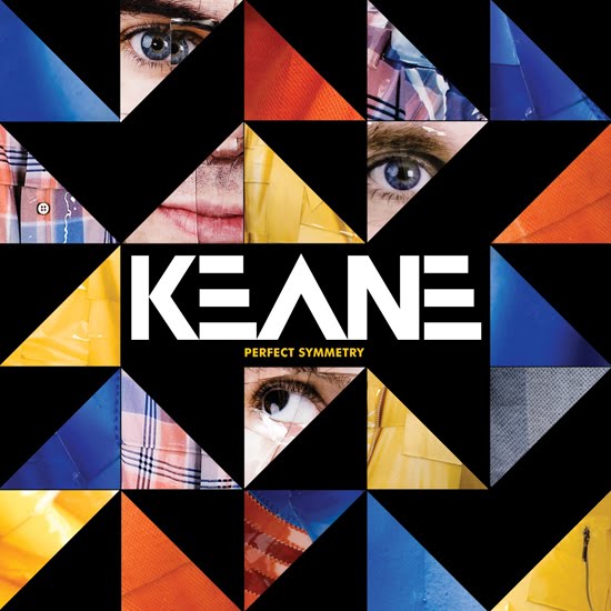
Both of these coupled with the use of a Russian style font on my digipak creates a modernist art deco style which uses block colour to make a bold statement. It also creates a sense of propaganda through its postmodernism, which is also very popular within the imagery of album covers for example Franz Ferdinand:I have tried to create a band style with the repetitive use of primary colours and green and to complete it I have created a logo for the band so that they are easily recognisable; as Goodwin said “artists develop motifs which recur across their work”, this is extremely useful in merchandising and advertising. During my research on logos I realised that all the band logos that are very prolific tend to be quite simple or built on already recognisable images, like The Ramones logo that is based on the official seal of the Director of National Intelligence in America:As I created a band logo from scratch I had to make it match the band style, so I used the same colours in the production of this logo:

From my research I noticed that band logos tend to contain a reference to the name of the band or band members. This is why I constructed my logo around this principle using the initials of the New York Fund and by including a black background I tried to create a striking image that stands out and is memorable.

How effective is the combination of your main product with ancillary texts?


Initially I planned an Album cover that would contain imported stills from our music video, which would relate to the tracks. However the research I conducted suggested that artists’ sleeves do not conform to this principle. It is for this reason that I did not use any imagery from the music video in the production of the digipak. Instead I decided to use a close up of the lead singer, (inspired by Franz Ferdinand's album which has been referenced previously) in order to strongly promote the lead singer and thus the whole band would benefit from this.

The band also benefits from the “recurring motifs” that I have developed in my digipak and magazine advert as researched by Andrew Goodwin who thought that recurring motifs and band styles are easily recognisable to audiences and developing fan bases. So by creating a band style using repeated colours on all four faces of the digipak and on the magazine advert with the same Russian style text also used, a band profile/style is created by which audiences can easily identify that style with the band. On top of this the creation of the logo (shown above), although not used on the magazine advert, creates an image that is easily recognisable and is very useful in merchandising especially to sell at gigs. So the logo can be applied to t-shirts and other fan memorabilia.


Due to the fact that I have quoted statements from NME and Q magazine it is most likely that the advert would be published in these magazines. Furthermore the magazines appeal to the same demographic as our target audience and they contain the information on bands of the same genre as The New York Fund, meaning that fans of existing bands will be reading these magazines and on seeing the advert would be more likely to listen to and consequently buy the album. So by creating a magazine advert that looks like the album cover creates an easily recognisable style, making it easier for the consumers who see the advert to find and buy the album.


What have you learned from your audience feedback?


How did you use media technologies in the constructions and research, planning and evaluation stages?

In all of these aspects of work the main piece of technology that has been used is the blog, on which I am now writing. It gives us students a new method of creativity, as we can add little bits to it at any given time and instead of carrying large numbers of folders and sheets of all the work we have done over the year to and from school we are now able to upload work straight onto the blog where constant feedback and guidance from teachers and peers can be given via the messaging service at the bottom of each post. The blog also lets me embed photos, powerpoints, and videos so that it is a lot more easy to read and the texts i reference are right in front of you.

Construction

The digital cameras we used to film the music video were Sony Handycams (shown above) and they allowed us to review the raw footage we had captured and thus make improvements and progress. As can be seen from the photo the camera's screen also turns round which means that a variety of shots can be achieved with losing the accuracy of seeing what you are shooting. On top of this these cameras also have an inbuilt zoom function which we used in the shots over the shoulder shots on the bridge to create a new dynamic to the footage and to create a nice transitional fade of two zooming shots together.

Editing software also had to be used in constructing the music video. The programme we used was Adobe Premier Pro which is a new version of editing software that has more features for us to utilise, for example the shot transition near the end of the video in which a fast zoom in and out of two shots creates a nice juxtaposition of the female and male characters searching for the same thing whilst allowing us to change the speed to fit in with the pace of the song. As well as providing new effects the programme also allows us to easily synchronise the visuals with the footage in accordance with Goodwin's theory in which the visuals reflect the sounds.

After designing my print productions, the next step was to take the necessary photos; for this I used a digital camera which allowed me to look through the pictures already taken and to discard any that were not good enough and to make revisions where needed. This made sure that the picture I used in my final print productions was just right.
After collecting the necessary photos the design had to be edited and finished; for this I used Photoshop Elements 7.0 which allowed me to create layers of design which would not affect other aspects of the design and would help in finding the perfect colour scheme which was vital to my design. Once the correct colours were found the programme also allowed me to apply them to all pieces of the print production package.

Research

At the beginning of the course, when trying to find an unsigned band to promote I found that the internet was a very useful resource in that websites like myspace.com and unsignedbandweb.com had a comprehensive selection of bands with songs that had enough dynamic to create a music video around.

In any kind of media research YouTube is a very important internet resource, and when researching similar texts and my music investigation it was extremely useful as it gave me immediate access to the artist's music videos and also the user comments which were especially useful in my media investigation. In my media investigation, powerpoint presentation was a useful programme as instead of writing an overly long essay the essential points are written down and explained thoroughly but without the bore of having to read lots of text. It also allowed me the easily embed photos and hyperlinks to websites.

My research into audience was aided by the microsoft programmes powerpoint and excel which allowed me to create lots of graphs to present the result of the large quantity of questionairres handed out to our peers. We distributed these questionairres via email which was also very useful and impartial.

Planning

Many different texts influenced our music video and so we have used many different technologies to view these for example, american beauty was a DVD but the footage could be found on YouTube. The Madonna painting could be found on google images, etc. So normal media consumer habits were eventually what inspired our music video.

When planning where to shoot our music video, we went location scouting around Norwich using another digital camera which abled us to go back and see the images of all the places we had found and weigh up all the positive and negative points about each one, thus allowing us to easily find the best places to film.

To upload pieces of planning, like the storyboards I had to use a scanner which was useful to get physical pieces of work onto the computer.

Evaluation

The blog has also assisted me as I have been able to upload pictures into my evakluation so that they can be compared and to amplify the points I have made in my writing. On top of this the feedback I have received from strangers on top my blog has been quite encouraging, although some I have been unable to read, and others are a little strange, but all the same it means that my work must be interesting, which is always good news.

Wednesday, 24 March 2010

Thursday, 11 March 2010

Varieties on the Magazine Advert

This was my first idea for the magazine advert as it includes both the tour dates and the album. I went with the band style and colours to promote make create an entire package with all the products included and I looked at an advertisement for Razorlight's tour (picture below) and took inspiration for the way in which the tour dates are presented. However this first advert is too much weighted towards advertising the tour and needs to be advertising the album more effectively, this the reasoning behind the next design I made.


This design focuses more on the album than on the tour which fits in with the requirements, however the simplicty of the design is ruined as there is too much going on mithin the advert, thus drawing attention away from the purpose of it and just moking it confusing. The only other option I have got is to remove the tour dates completely and just advertise the album. If I was advertising the tour though i would use my first idea as this is less confused and appears more professional because it is based on a proper production advertising the Rasorlight tour.

Here I have removed the tour date to make it less cluttered and have enlarged the image of the album to just advertise that. It is this which is my final magazine product and is the one I have chosen to use in conjunction with the digipak and the music video because the image of Tamas joins the three and the block colour pattern joins the digipak to the magazine advert as well as the image of the digipak on the advert.


Final Magazine Advert and Digipak Products

These are my final print productions that work together for my band, and a smal explanation of what each is:

This is my finished booklet (above and below) The first square which includes the logo will become the back page of my digipak booklet and the second square next to it will become the front cover of my digipak. The two pages below with the lyrics will become the inside pages, folded down the middle.

This will become the back of the entire digipak with the track listing on the back and all the copyright company information in the bottom left corner. The two bars at the side with the band name and album name on will be folded over to make a recognisable side for the album.


This is a magazine advertisement for the digipak I created (shown at the top of this post). It is A4 in format to be easier to see and thus gaining more interest and publicity.

Distribution

As I am marketing an independent unsigned band; the album would probably be distributed by independent music stores like Sound Clash in Norwich instead of at mainstream stores like HMV, but because the advert states that they have been voted best newcomer and the best album by two prominent magazines, small amounts of the digipak might be marketed and sold by shops like HMV, to draw attention to this independent band.

Monday, 8 March 2010

Logo Plans

From the research I performed earlier in my blog I decided that a simple logo can transform a bands image and make them internationally well known like the Rolling Stones (below) for instance whose mouth insignia appears on all sorts of merchandise and is recognisable not just in England and America. I am not necessarily saying that to become popular a band must have a logo, on the contrary to have a logo is merely an easy way to design merchandise and thus because this one image encapsulates the band it becomes a brand which is fashionable to wear and to advertise the audiences support of the band. For these reasons I decided to attempt to create a simple yet effective logo for The New York Fund. It had to conform to the band image I had already created with the digipak front cover and the magazine advert, this is why the colours I chose matched those that were used on these two productions; this way a brand style is more prevalent and these colours can be carried on to other albums, singles and merchandise in different styles/motifs to expand on the band style.


The first logo I created (shown below) was playing with the letter N for New York Fund and it used the colours I had set out to use and remained simple which fits in with the band style I had created, however this logo is a mite dull, although I took inspiration from The White Stripes amazing video (shown below).


It does not have the same impact as the moving image fading into the distance! On top of this I would like to use more of the initials to make the logo clear this is why my second attempt was a lot more successful.

This is the logo I have chosen because it uses the entire initials and the colours that signify the band style. The font I have kept the same as on the digipak and magazine advert to also become part of the band style, and the parallel block colour also does this. The green strips add an extra dimesion to a design that would otherwise be quite dull, but i think the simpleness of this design works well with my band style thus almost creating brand style.

Friday, 29 January 2010

Russia Inspired Digipak's

Whilst doing looking for inspiration from other bands digipaks I have come across a lot of popular bands that have utilised a very Russian Propganda style with their imagery.I was very intirgued as it appears that it is quite popular with target audiences similar to ours. One of the popular bands I found were Franz Ferdinand:

The straight lines emerging from her face reflect power and control is a lot like propaganda posters. The soviet propaganda poster below is extremely similar and the message emmited by the image seems to be one of pass on the word which is a very clever marketing technique to make the product popular.


The text on this soviet poster is very bold like the Franz Ferdinand front cover which fits in with the general style of the bold statement front cover.

paganda texts, to make up an A shape that stands for Athlete! The bold block colours make a big statement and have a connotation of power and brilliance.


This album cover for Art Brut vs. Satan has a distinct propaganda style feel to it with the lines and blocks of colour coming from set points as in this Chinese communist poster where the lines emanate from the man in the foreground giving him the power; thus drawing your eye to that fixed point. The use of red is also instrumental in these texts as it is startling with many connotations with blood, anger and predominantly power.

Thursday, 21 January 2010

Digipaks for Bands Influencing The New York Fund

On their MySpace page, The New York Fund have outlined some of the bands/musical artists that have inspired them and although The New York Fund would not impersonate the styles of their idols it is interesting to look at the album covers of the artists who inspire them and more importantly their music.

Neil Young


This Neil Young Album was released as his debut solo album in 1968 and so reflects the 'Hippy' style fashion that was popular at this time. The artwork is very clever showing Neil Young's already famous face on his own instead of with a band (he was in many). It also reflects the turbulent time of 1968 which was the middle of the Vietnam War, Martin Luther King Jr is assassinated, Andy Warhole is shot, The Nigerian Civil War, Robert. F. Kennedy is also assassinated etc. The waving sky perhaps shows the uncertain days in which this is released and the psychedelic colour reflecting the popular culture in the 60's.


The image of Neil Young in shades of green with the upside down cityscape on his clothing also reflects the love of nature and peace in this era. By appearing in this green filter light Neil Young is portraying himself as not entirely human. On top this in his music he tends to tell a story and this front cover mirrors this technique.


Another of Neil Young's album covers which is of stark contrast to that of the one above which is bright and cheerful, this album, After the Gold Rush released in 1970 is very bleak with a solarised picture of Neil Young passing an old woman in the street. After listening to this album I have realised why this album merits this dark album cover as the songs enlist a sorrowful tone with a hint of despairing love this album cover really does reflect the saying "life is hard and then you die".

At least we cant say that Neil Young is predictable, from the album above to the one below!

The Band
The Band's album inventively named The Band (released is very plain with a picture taken of them at Woodstock. The browny green border colour doesn't really do much for the appeal of this album, but the photo gets their image out there and has the opportunity to become an iconic image like those of The Beatles, queen etc. which show the band in their glory!


Bob Dylan

Moving on to a more interesting album cover from another artist inspiring The New York Fund.
This fuzzy image reflecting the rush of modern day life (hence the title of the album). At this point in Dylan's career he is very well known and thus there is no need for him to put his own image on his album cover however his earlier albums have photos of himself on the front to get his image well known and recognisable.

Ryan Adams
Similarly, this image on Bryan Adams album reflects the title of the album; 'Heartbreaker' as this photo has a depressed, languid feeling which also reflects the type of music he produces. The cigarette that is in both of his albums (above and below) shows a state of solitary solemn contemplation and adds to the relaxed tone of the images. The cover above has a black band across the top to make the text stand out with his name in white conveying a sense of innocence juxtaposed against red text the says 'Heartbreaker' shows perhaps that there are two different sides to Ryan Adams' music. and due to the fact that his name is in a different font to that of the title adds more import to his name which would make the audience recognise the artist as well as his image.
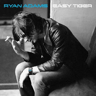
The album cover below is in grey scale which is a commonly used technique that creates a monochromatic image that doesn't distract any attention yet again from the coloured forms on an image in this case his name which stands out in electric blue and would draw the audience's attention to it in a shop!


Teenage Fanclub


These two album covers are extremely different from those I have looked at above. The first is very interesting; it is from a compilation album consisting of alternative versions of their songs which was released in 1995. The front cover is easily recognisable and memorable with red writing which stands out against the perverse image and perhaps brings to mind the image of blood in context with the cruel image in which someone seems to be enjoying having a bag over their head with a shouting face on the front. This front cover is strange in the fact that it does not seem to relate to anything, and the album title of Deep Fried Fanclub also does not seem to relate. This shows how album covers don't have to bear relevance to the material or can have an agenda of their own.

Yet another strange album cover from The Teenage Fanclub, they do not seem to mind what the image is on the front of their albums as long as they are interesting and original. This image for instance seems to be referencing the way in which pollution affects the world and we just sit back and watch. with the image of the factory smoke heading up towards the darkened sky split by a deep cut producing light amongst the cloud. A conundrum.

Friday, 25 December 2009

Digipak Cover Plans


These are my initial ideas for the design of my digipak cover. I am aware that these may change slightly over the course of making it. Idea 3 (below) is the idea I like the most so this is the plan I am going to use.


Idea 3 is my favourite concept as it is simple and the geometric pattern is by far the best due to the way they seem to emanate from Tamas' face and the designs without the geometric pattern are a little dull and have too much happening.
I really like the idea of making a bold statement with the digipak cover by using bright primary colours against a black background to create a striking stand out image. I also think it is important when a band is new to have a picture of the band members or the lead singer on the front to make them easily recognisable and to promote the band's image, however many bands do not do this in their first album release for example:


On top of this I want to create a recognisable image for the band that can be used in promotional merchandise; the use of red and yellow in a geometric pattern makes a bold statement next to the pallid grey scale face of Tamas.


Update: I have just realised that although I love this colour scheme, it is the colours of the German flag which makes this album cover quite confusing in terms of nationality as the band is called The New York Fund, it has a German flag background, a review saying 'Best new British Band' and vaguely Russian looking text.


Although this may be a good design and if it was to be used in 'the real world' this would be fine, however in the specification it defines that the digipak should show elements of Britishness! This is why I have had to change my design slightly (see below).
By adding the green and blue graphics to the design some ofthe simplicity has been lost from it but the added brightness and the way it no longer looks like the German Flag makes this a lot better.


Tuesday, 8 December 2009

Comedy and Music

Many comedy films have been made about the Music Industry, however in recent years the music industry seems to have become increasingly obsessed with money and the power struggle between consumers and producers. On top of this the age of Rock 'n' Roll is over and it is no longer a socially acceptable fact to take drugs and drive your car into a swimming pool. This is shown by the condemnation of Amy Winehouse and Pete Doherty for taking drugs. Don't get me wrong I am not condoning copious amounts of drug taking that colours the lives of Ozzy Osbourne and Jimi Hendrix but the music industry now seems so uptight, only accepting mainstream artists if they fit a certain genre: tall, skinny, muscular, good looking and an ability to sound just like everybody else. The days of liking music for musics sake and forgetting the private life of artists is at an end!


Still Crazy Trailer
This film released in 1998 spans the careers of a hit band of the 70's and their attempt to revive their music lives with a reunion tour of some of the most disgusting venues. This film is a satirical view of rock stars and their lives incorporating good music with alcohol, drugs and jokes. This sort of film has also been released recently with 'The Boat That Rocked', in this respect it is not unusual to see comedy and music hand in hand. However these film are all based in the past music scenes and the current stars of the music industry are taken extremely seriously, with magazine stories covering parts of their lives and constantly analysing what they wear and what they do. This serious view on the industry dictates the type of mainstream music that is now produced and all sounds slightly similar as to stray from the tracks of acceptable behaviour is to be under ridicule and is career suicide in the eyes of the music industry.


'Big Bottoms' by Spinal Tap from the film This is Spinal Tap, as you can tell from this clip comedy is used satirically just as in Still Crazy through a fictitious band and their lives. Set in the time of release (1984) this moc-umentary tries to reveal the lives behind the music and the use of comical songs like 'Big Bottoms' certainly does make a satire of the music industry.

As I have said before the world of comedy and music often combine to create a whole new experience. Comedians like Tim Minchin, Victoria Wood and Bill Bailey do this perfectly, as during their stand-up performances they perform funny songs.


Basically what I am trying to say is that Music and Comedy mesh so well and yet the music industry is full of rules and intrusion from the media industry that the comedy is often overlooked. so wouldnt it be great if audiences were not so concerned with the private lives of the celebrities but are more interested in enjoying the music and having fun!

Saturday, 5 December 2009

The Reigning Champion of Disney

Without a doubt in mind if I had to choose a Disney Character that reigns supreme it would have to be Genie from Aladdin. He with stands the pass of time and the pass of new generations of Disney characters (that are now fused with Pixar)to still be the popular icon that he is today.

It is not only this that persuades me, he is the king of Disney. I have formulated a list of reasons why he is Disney's best creation and have backed some these points up with evidence:
  1. He is the ultimate performer - sing, dance, entertain, magic, comedy, impressions (Robert De Niro - Taxi Driver - 'You Looking at me?'
  2. He is blue and so easily recognisable, i mean how many floating blue men with no legs are there?
  3. He is a huge symbol of magical power and prowess
  4. He is compact
  5. Powerful
  6. Immortal - never ending peace
  7. He can change shape!
  8. Knows how to party
  9. One man army - so can defeat anyone (even Russia)!
  10. Speaks many different languages
  11. He gives wishes to anybody who rubs his lamp meaning that he treats everyone fairly and with the same rules applied:
  • No wishing for more wishes - shows intelligence which is also shown by his rule of no refunds!
  • No Killing - Shows morals
  • No bringing people back from the dead - also shows morals and intelligence but free thinking and an ability to rule
  • No forcing people to fall in love - he does not mess with minds
All of the above are shown in the clip below:


8. The Genie cares about friends - knows who to trust
9. He promotes selflessness - didn't hold Aladdin to his promise
10. He doesn't care about looks with a big blue belly and a silly comic hair cut
11. He is now free to do whatever he pleases and so he has more power

All of these things are shown in the ending scene of Aladdin:


By adding all these factors together you discover that the Genie would be a magnificent ruler and the fact that he has been locked away from the world for years should not be a draw back, for example all you need to do is look at Nelson Mandela who was locked away for years but ultimately became a peaceful ruler.

From the point of view of the creator's side the Genie is very interesting because they have implemented many stereotypes but at the same time broken many, for instance the genie is over weight with a bubbly cheerful disposition which is a huge stereotype. On top of this he has a gold earring and a curly beard signifying that he is from the middle-east. These techniques are rife within Disney but the Genie breaks some of these rules by transforming in to American icons like Forrest Gump (Aladdin and the Prince of Thieves). So he is unique in the way that he is designed and the methodology he transmits. If you were looking for a Disney character to reign supreme in terms of representations the best one to choose would have to be Mulan, who although has to masquerade as a man to do what is neccessary, she is an empowering symbol to women, showing that what men can do so can women in so doing creating an equality between the sexes.

Going back to the Genie however we should always remember that underneath all the blue satirical comments he is .... Robin Williams! Which in itself deserves a crown!

Wednesday, 11 November 2009

Theories of Audience Consumption

Theories of audience consumption have developed over time along with the evolution of consumption habits in conjunction with the proliferation of hardware and content.


'Uses and Gratification Theory’


This Theory was initially created by a man named Lasswell in 1948 but was then adapted by Katz, Bulmer and another colleague for the modern audience who use new technologies.

The Uses and Gratification theory views the audience as active, meaning that they actively seek out specific media and content to achieve certain results or gratifications that satisfy their personal needs. It contradicted older views that said the audience was passive.

The uses and Gratifications Approach has five basic assumptions:

1. Audience conceived as active
2. People use the media to their advantage more often than the media uses them.
3. The media competes with other sources of need satisfaction.
4. People are very aware of their motives and choices and are able to explain them verbally if necessary.
5. The audience can only determine the value of the media content. It is the individual audience members who make the decision to view the media; therefore, they place the value on it by their individual decision to view it.

In yesterday’s lesson we were thinking about why audiences consume certain media and this links with the theory because the theory states that the audience actually seeks out the specific texts it wants instead of stumbling on them randomly meaning that there are reasons behind consuming texts and the media has to abide by those reasons to create an audience.

Thursday, 5 November 2009

Leaving the Death Ambiguous

So far, we were intending to have a suicide scene at the end of the video using a fake gun the would be used to shoot Tamas; however we have decided that we are trying to promote the band and this scene would create a depressing image which is definitely not the way the band would want to be promoted, on top of this there have been recent concerns expressed in the media of cluster suicides in Wales so there is also the possibility that an audience might be offended by the suicide scene. This means that the record would not sell very well and seeing as how music videos are designed to boost record sales that would be a pretty unsuccessful video.

We have already shot a scene in which Tamas walks into the light signifying his death, by using this scene the death remains ambiguous but we can still use this great shot. Because we are not using our Death scene we therefore are having to get some more footage to fill the time we have decided to use this as an opportunity to shoot some more close-ups to strengthen our narrative and make our video more interesting for the audience.

We are using Madonna's video for 'Like a Prayer' as inspiration for this


If the embedded video does not work properly follow this link for a better quality video
http://www.youtube.com/watch?v=79fzeNUqQbQ&feature=fvsr

This video for Madonna's song "Like a Prayer" has shown us that a narrative can be transformed by a myriad of different shot types and lots of close-ups.


For example, as you can see there are plenty of close-ups of Madonnas face, by doing this the audiences attention is kept and it promotes the artist. This type of shot is really easy to achieve and is very effective so we will be using this is our own video.

In the video this shot is played with a slow zoom as are other shots in the video. By using a slow zoom in the mellow sections of the song whilst the artist is the focus of the shot is a more imaginative way of promoting them and it allows for the shot to be slightly longer than usual as the added dimension of the zoom keeps the audiences attention for longer. This is also another technique we can easily utilise in our own video to create an improvement to our medium to close-up shots.
The extreme close-ups above and below are also really useful because they add significance to the subject matter. In the picture above for example the extreme close-up reinforces the recurring image of roses which connotes love. However it also symbolises the outward beauty of the man with the difficult racist past represented by the hidden thorns. These extreme close-ups enable a theme to be quickly produced.

The extreme close-ups are also convienient for use in our music video. Madonna's video has taught us that a theme, in this case religion, can amplify the meaning of the lyrics but can also make the narrative easier to comprehend. We have not got a connoting theme like this video has but it is useful to know if we do create one or if we ever make another music video.


Monday, 2 November 2009

Alternative Endings

Inspired by The French Lieutenants Woman by John Fowles we are thinking of having two alternative endings to our music video to give a new dynamic and create a wider interest. On top of this it is a nice feature to add on to our DVD allowing the audience to pick their favourite ending and increasing our demographic whilst creating an active audience that will consume the product more thoroughly.

Ideas for alternative endings:
  1. Where the male and female meet and forgive each other to create a more conventional, Americanised ending. This would appeal to a wider more international audience like American's which is a market that every artists wants to conquer as that means a lot of money.

  2. Where the couple walk past each other and ignore one another; which is what happens in the end of The Third Man (below). To create a sense of mystery through the ambiguity.


  3. We already have some nice random shots of Tamas and Lucy walking into the light which consumes them . This would create a really stylistic ending and leave a great deal of ambiguity because is he dead or merely dead to her? - This is probably the ending that we will use but if we get the chance we will try and make the others to be able to market for a wider audience.


The use of alternative endings does mean a lot more work so they will only be made if we have enough time.

Thursday, 29 October 2009

T4 - brainwashing the music scene?

Shooting Schedule

During our lesson time at school Ms Barton our teacher for the Production part of the course allowed us to film which was extremely useful considering we have two, two hour slots with her which meant that we had the potential to film for four hours a fortnight. As a group we grabbed this opportunity by the horns and went out for two hours just to find the locations in the city. We also went out twice to film during these lessons. However this was not enough because we have several different locations so we decided to go out after school on random dates to film. So we ended up filming.
  • 11.20am - 1.20pm on Mondays during our lessons.
  • 4.00pm - as long as it takes monday, tuesday and occasionally wednesday evenings
By filming at the beginning of the week this enables us to edit our existing footage and identify early on whether their are any shots that could be improved or if some footage is just not good enough.

Before half term (26th October - 2nd November) we filmed a lot of footage on Friday 25th October, it was because of this that as a group we decided to push on with the editing and shooting throughout the holiday, so I inivited them both round on Monday 26th and Tuesday 27th October. We had previously decided to edit our video using software that Tamas had () on his laptop instead of using the less advanced programme on the school computers, this enabled us to edit at my house over the holidays. We also shot a lot more footage in the village where I live on the 27th, to create an interesting mise-en-scene of the vibrant city life next to the river juxtaposed with the bleak, silence of Mulbarton graveyard.

The initial raw footage that we have filmed down Elm Hill has not turned out very well as we didnt film enough close-ups and extreme close ups which is hard to achieve when filming someone walking across cobbles. It is for these reasons that we have decided to refilm and not use much of this first shoots footage.

We have also had to film some extra dream/memory footage which we are going to film at Cringleford park on 9th November. this footage shouldnt take too long as we intend to just use the swings to get closeups and high angle shots etc.
Update: Unfortunately when we got to the park the swings had been removed a few days before hand and we had to improvise using the Carousel. However this footage has turned out really nice and is better than it would have been if we had used swings.

Saturday, 17 October 2009

Parka - 'Disco Dancer'


I recently bought a Creative Zen music player and on it came this music video by Parka. They are an 'indie' band as it says on their MySpace page, and I am putting this on my blog merely for the fact that their video has amazing utilisation of balloons.

The video although a little long and tedious has shown me that narrative is not neccessarily needed within a music video however an added dynamic is needed like here the balloons are used. On the other hand this video would benefit from more dynamics instead of just the balloons which by the end the novelty has gone. So in music videos without a narrative, like this one, more than one interesting dynamic perhaps different coloured lighting or more special effects and a larger variety of shots is definitely warranted to grab and keep the audiences attention.


New York Fund 'The Guns of Camden Town'


Whilst looking up some live footage of The New York Fund I ran across this video for their song The Guns of Camden Town. Previously I had not realised that they had any music videos to their songs and suddenly thought that they might be signed however after watching it you can tell that it is an amateur video. It is extremely long with no narrative but random short references to musical instruments and old looking lamps. The editing is really good; fitting in with the beat of the music especially at the start where the lights are switched on and dimmed and the foot is stamping.

This is of stark contrast to our proposed music video because we have a large narrative that runs throughout with no shots of the band playing. However our song has greater potential for visual images because of the lyrics whereas this one doesn't.

Audience Research

Before we started actually researching our target audience, we decided to make an estimate as a group based on stereotypes and the genre of our music video. Here is the result:


This was a little bit of fun really: we decided that due to the fashions at this time which are popular our target audience would be predominantly 16-25 years old 'indie kids' which the Find Your Tribe website defines as:

"There's nothing like the twang of a guitar to get your converse tapping. Indie Kids are part of a mass - whether that means swaying with their friends at a gig, commenting on Drowned in Sound's message board or trawling through band profiles on My Space for the next exciting sound. It's amazing what can still be done with a guitar, you know."

Although obviously this is only a hypothesis and will only be proved until after our questionnaires have been handed out.


Here is another target audience profile just as the one before but created after the research was carried out: