Showing posts with label Planning digipak cover. Show all posts

Thursday, 11 March 2010

Final Magazine Advert and Digipak Products

These are my final print productions that work together for my band, and a smal explanation of what each is:

This is my finished booklet (above and below) The first square which includes the logo will become the back page of my digipak booklet and the second square next to it will become the front cover of my digipak. The two pages below with the lyrics will become the inside pages, folded down the middle.

This will become the back of the entire digipak with the track listing on the back and all the copyright company information in the bottom left corner. The two bars at the side with the band name and album name on will be folded over to make a recognisable side for the album.


This is a magazine advertisement for the digipak I created (shown at the top of this post). It is A4 in format to be easier to see and thus gaining more interest and publicity.

Distribution

As I am marketing an independent unsigned band; the album would probably be distributed by independent music stores like Sound Clash in Norwich instead of at mainstream stores like HMV, but because the advert states that they have been voted best newcomer and the best album by two prominent magazines, small amounts of the digipak might be marketed and sold by shops like HMV, to draw attention to this independent band.

Monday, 8 March 2010

Logo Plans

From the research I performed earlier in my blog I decided that a simple logo can transform a bands image and make them internationally well known like the Rolling Stones (below) for instance whose mouth insignia appears on all sorts of merchandise and is recognisable not just in England and America. I am not necessarily saying that to become popular a band must have a logo, on the contrary to have a logo is merely an easy way to design merchandise and thus because this one image encapsulates the band it becomes a brand which is fashionable to wear and to advertise the audiences support of the band. For these reasons I decided to attempt to create a simple yet effective logo for The New York Fund. It had to conform to the band image I had already created with the digipak front cover and the magazine advert, this is why the colours I chose matched those that were used on these two productions; this way a brand style is more prevalent and these colours can be carried on to other albums, singles and merchandise in different styles/motifs to expand on the band style.


The first logo I created (shown below) was playing with the letter N for New York Fund and it used the colours I had set out to use and remained simple which fits in with the band style I had created, however this logo is a mite dull, although I took inspiration from The White Stripes amazing video (shown below).


It does not have the same impact as the moving image fading into the distance! On top of this I would like to use more of the initials to make the logo clear this is why my second attempt was a lot more successful.

This is the logo I have chosen because it uses the entire initials and the colours that signify the band style. The font I have kept the same as on the digipak and magazine advert to also become part of the band style, and the parallel block colour also does this. The green strips add an extra dimesion to a design that would otherwise be quite dull, but i think the simpleness of this design works well with my band style thus almost creating brand style.

Friday, 29 January 2010

Russia Inspired Digipak's

Whilst doing looking for inspiration from other bands digipaks I have come across a lot of popular bands that have utilised a very Russian Propganda style with their imagery.I was very intirgued as it appears that it is quite popular with target audiences similar to ours. One of the popular bands I found were Franz Ferdinand:

The straight lines emerging from her face reflect power and control is a lot like propaganda posters. The soviet propaganda poster below is extremely similar and the message emmited by the image seems to be one of pass on the word which is a very clever marketing technique to make the product popular.


The text on this soviet poster is very bold like the Franz Ferdinand front cover which fits in with the general style of the bold statement front cover.

paganda texts, to make up an A shape that stands for Athlete! The bold block colours make a big statement and have a connotation of power and brilliance.


This album cover for Art Brut vs. Satan has a distinct propaganda style feel to it with the lines and blocks of colour coming from set points as in this Chinese communist poster where the lines emanate from the man in the foreground giving him the power; thus drawing your eye to that fixed point. The use of red is also instrumental in these texts as it is startling with many connotations with blood, anger and predominantly power.

Thursday, 21 January 2010

Digipaks for Bands Influencing The New York Fund

On their MySpace page, The New York Fund have outlined some of the bands/musical artists that have inspired them and although The New York Fund would not impersonate the styles of their idols it is interesting to look at the album covers of the artists who inspire them and more importantly their music.

Neil Young


This Neil Young Album was released as his debut solo album in 1968 and so reflects the 'Hippy' style fashion that was popular at this time. The artwork is very clever showing Neil Young's already famous face on his own instead of with a band (he was in many). It also reflects the turbulent time of 1968 which was the middle of the Vietnam War, Martin Luther King Jr is assassinated, Andy Warhole is shot, The Nigerian Civil War, Robert. F. Kennedy is also assassinated etc. The waving sky perhaps shows the uncertain days in which this is released and the psychedelic colour reflecting the popular culture in the 60's.


The image of Neil Young in shades of green with the upside down cityscape on his clothing also reflects the love of nature and peace in this era. By appearing in this green filter light Neil Young is portraying himself as not entirely human. On top this in his music he tends to tell a story and this front cover mirrors this technique.


Another of Neil Young's album covers which is of stark contrast to that of the one above which is bright and cheerful, this album, After the Gold Rush released in 1970 is very bleak with a solarised picture of Neil Young passing an old woman in the street. After listening to this album I have realised why this album merits this dark album cover as the songs enlist a sorrowful tone with a hint of despairing love this album cover really does reflect the saying "life is hard and then you die".

At least we cant say that Neil Young is predictable, from the album above to the one below!

The Band
The Band's album inventively named The Band (released is very plain with a picture taken of them at Woodstock. The browny green border colour doesn't really do much for the appeal of this album, but the photo gets their image out there and has the opportunity to become an iconic image like those of The Beatles, queen etc. which show the band in their glory!


Bob Dylan

Moving on to a more interesting album cover from another artist inspiring The New York Fund.
This fuzzy image reflecting the rush of modern day life (hence the title of the album). At this point in Dylan's career he is very well known and thus there is no need for him to put his own image on his album cover however his earlier albums have photos of himself on the front to get his image well known and recognisable.

Ryan Adams
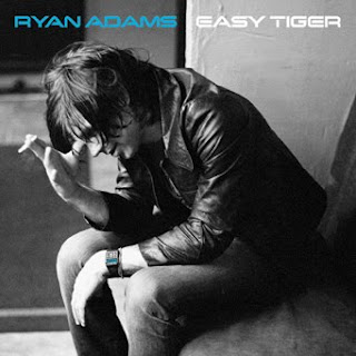
Similarly, this image on Bryan Adams album reflects the title of the album; 'Heartbreaker' as this photo has a depressed, languid feeling which also reflects the type of music he produces. The cigarette that is in both of his albums (above and below) shows a state of solitary solemn contemplation and adds to the relaxed tone of the images. The cover above has a black band across the top to make the text stand out with his name in white conveying a sense of innocence juxtaposed against red text the says 'Heartbreaker' shows perhaps that there are two different sides to Ryan Adams' music. and due to the fact that his name is in a different font to that of the title adds more import to his name which would make the audience recognise the artist as well as his image.

The album cover below is in grey scale which is a commonly used technique that creates a monochromatic image that doesn't distract any attention yet again from the coloured forms on an image in this case his name which stands out in electric blue and would draw the audience's attention to it in a shop!


Teenage Fanclub


These two album covers are extremely different from those I have looked at above. The first is very interesting; it is from a compilation album consisting of alternative versions of their songs which was released in 1995. The front cover is easily recognisable and memorable with red writing which stands out against the perverse image and perhaps brings to mind the image of blood in context with the cruel image in which someone seems to be enjoying having a bag over their head with a shouting face on the front. This front cover is strange in the fact that it does not seem to relate to anything, and the album title of Deep Fried Fanclub also does not seem to relate. This shows how album covers don't have to bear relevance to the material or can have an agenda of their own.

Yet another strange album cover from The Teenage Fanclub, they do not seem to mind what the image is on the front of their albums as long as they are interesting and original. This image for instance seems to be referencing the way in which pollution affects the world and we just sit back and watch. with the image of the factory smoke heading up towards the darkened sky split by a deep cut producing light amongst the cloud. A conundrum.

Friday, 25 December 2009

Digipak Cover Plans


These are my initial ideas for the design of my digipak cover. I am aware that these may change slightly over the course of making it. Idea 3 (below) is the idea I like the most so this is the plan I am going to use.


Idea 3 is my favourite concept as it is simple and the geometric pattern is by far the best due to the way they seem to emanate from Tamas' face and the designs without the geometric pattern are a little dull and have too much happening.
I really like the idea of making a bold statement with the digipak cover by using bright primary colours against a black background to create a striking stand out image. I also think it is important when a band is new to have a picture of the band members or the lead singer on the front to make them easily recognisable and to promote the band's image, however many bands do not do this in their first album release for example:


On top of this I want to create a recognisable image for the band that can be used in promotional merchandise; the use of red and yellow in a geometric pattern makes a bold statement next to the pallid grey scale face of Tamas.


Update: I have just realised that although I love this colour scheme, it is the colours of the German flag which makes this album cover quite confusing in terms of nationality as the band is called The New York Fund, it has a German flag background, a review saying 'Best new British Band' and vaguely Russian looking text.


Although this may be a good design and if it was to be used in 'the real world' this would be fine, however in the specification it defines that the digipak should show elements of Britishness! This is why I have had to change my design slightly (see below).
By adding the green and blue graphics to the design some ofthe simplicity has been lost from it but the added brightness and the way it no longer looks like the German Flag makes this a lot better.


Tuesday, 13 October 2009

Similar Bands and their Digipak Covers

I have had a look at several different digipak covers for different bands and have decided that the majority of the time for genres like ours of indie/rock the digipak covers will not relate to anything on the album or will use shots from one of the tracks music video or imagery from one lyric or will use/create a band identity so that they are easily recognisable.

A great example of a digipak not relating to anything is this one by the rumble strips. However the images presented are how the band want to be viewed; with the stained vest showing his chest coupled with the scary sharp toothed dog creates a 'tough guy' image. Which fits in with their video 'Not the Only Person' (shown below)


In this video the main protagonist defeats a large amount of thugs with a magical woman who emerges from his chest so the tough image fits in thus creating an identity for the band as young tough and experimental.

This Razorlight cover from what I can tell has little or nothing to do with any of their music videos, but instead is a collage of random everyday items like keys and memories. This could fit in with the title 'Up All Night' as this could be the memories or it could represent the chaos caused by being up all night. The title of the album tend to be the debut song/video and in this case it is. The picture of the lead singer in the television screen is a good way to advertise the band through the primary figure who everyone will recognise.

This album cover by The Rakes is very interesting it took me 10 minutes to figure out that what appears to be random shapes actually reads as 'Klang' which is the German word for sound. This album does not have any pictures of the artist on it but it has created a band image (as you can see below) that can be repeated effectively using different forms and colours. This does show the fact that parallel lines and block colours are very popular in the fashion of album covers at the moment.

This is why I think that using block colour imagery on my album cover will appeal to the modern consumer market.

I love this album cover as it uses patterns within patterns which also fits in with the title of 'Perfect Symmetry' and follows the fashion of straight lines and block colours. The inventiveness of the design including triangles of facial features made out of what seems to be a collage adds an extra dimesion to the pattern and makes the cover more interesting. The font is also really interesting and has a russian hint with an original shaped E.

Overall looking at these digipak covers has given me some ideas of what to use in me own digipak production:
  • Block colour
  • Russian text
  • Named after the debut song
  • A colour pattern/style

Friday, 3 July 2009

CD front covers....

As I have already posted, many bands have their own personal logos to help create their identity and make them widely known. Bands also use their CD covers the create their image and enforce it, this is why you often find artists from the same genre have the same sort of CD covers!

A prime example of this is the typical boy band CD cover (shown above and below) with the band posing in front of an outside back drop. As you can see in the Boyzone cover they were often action shots with the band walking to the camera, these types of shots mirror the music the band produce, which is corny, sloppy and designed for young teens. As teenage heart throbs the bands have purposefully designed their album covers so that young girls can see the band on the front and be enticed into buying it. On top of this as boy band like Boyzone have a very large target audience from children to grandmas the album have to be user friendly unlike 50Cents album (below) which is designed to be risky and 'hardcore!'

The Backstreet Boys album cover depicts the band as very heavenly and enduring as they are wearing white shirts over the black signifying their outward innocence. The contrast is also quite high making their faces seem infallible and gives them a slight glow like angels. the dirty weathered look of their surroundings contrasts with their whiter than white shirts and makes the band seem more real and human. Another common theme with boy band albums is that they are often unnamed with the album only bearing the bands name/logo this keeps it nice and simple and also leaves more room to have the name large and imposing as shown above. The crisp slanted writing adds impact to the words because in making it 3D with a shadow effect gives the impression of a Hollywood blockbuster giving a bang. The black to white fade on the title also keeps in with the monochrome feel off the cover which juxtaposes black and white like bad and good, making the album contradict itself and appeal to a wider audience with those after sweetness and light and those after a little bit of rebellion.


In contrast with the Backstreet Boys, Boyzone were very successful and have even begun making a popular comeback. This album was made shortly before they announced their split and so is less mainstream than that of the backstreet boys although it does bear the same signifiers of the posing action shot and the matching outfits although there seems to be more freedom with their attire as the man on the end is wearing a leather coat and matching trousers. The layout of the band members is also strategic in this, as Ronan Keating the main singer is placed at the front with the second main singer in the forefront as well, with the other three walking behind.

I picked this album because its completely different to both the boy bands and 50Cents. One main reason for this could be that Incubus are an alternative metal/rock band with a hint of funk, similarly their album cover is very alternative and different. The colours of red signifies love/blood and juxtaposed with the vibrant yellow is unsettling making the album seem a little sick so immediately the audience knows that this album is not ordinary. On top of this the title 'A Crow left of the Murder' can be interpreted as a murder is the collective term for a group of crows so a crow left of the murder in that sense would mean rebelling against the norm, which fits in perfectly with incubus's music. This CD front cover perfectly describes the type of music held within and the bands general thesis.
This front cover from 50cent is different yet again from the others i have shown you and this is because of the completely separate ends of the music spectrum they all occupy. The 'hard man' image portrayed here fits in with the rap genre of music and also with his self styled image in which he has been shot nine times, hence the bullet/vandalised hole in the glass before him, perfectly framing the cross chain creating a conflicting image of peace and conflict, this is mirrored in his music, lyrics and film. On top of this the red background signifies violence and blood, which also fits in with the title of the album, 'Get Rich or Die Tryin', this is written in an elegant font that is often used in tattoos. The phrasing sounds like a motto and as far as motto's go this is very materialistic. This point of view contrasts with his lack of clothes but matches perfectly the huge watch and designer belt. Overall this album cover is typical of the Rap genre with little experimentation, violence and the artist posing.

Logos...

Many of the iconic symbols in the world are from bands, these logos are a great method of quickly identifying the band and for the band to become known world wide. Some of the most iconic band logos are shown below:


This logo is extremely popular from the Rolling Stone and can be seen on t-shirts, bags etc. The logo conveys a sense of what the band are about with the defiant tongue sticking out at establishments and those in power. It may also be reminiscent of Mick Jagger's huge mouth (Shown below).

This is the Blink-182 Logo which is very prolific and shows the band as happy but with a twist as the eyes are crosses as if the face is dead. Also the arrows present them as on going and mixed genres however when asked about the meaning of this logo the Drummer, Travis Barker, said "It just had to be a cool kind of happy face but i wanted arrows". despite there being little meaning behind this logo it has definitely made the band noticable as this logo appears on all sorts of popular merchandise.


This logo is also very popular and belongs to the Ramones. This logo is great for the band as it makes their fans remember the band members names which is very unusual as normally the lead singer would be remembered but the others would not. This logo is an edited version of another logo, which is the official seal of Director of national intelligence in America whose job it is to provide sound legal guidance on critical national security issues facing the Intelligence Community. By using and editing this official seal the Ramones are taking a jibe at the USA, also by using an already well known logo they immediately make themselves well known and easy to remember as the band who are going against convention and against the people in power. WOOHOO REBELLION!!

The Who' s logo is straight to the point with the bold writing over the top of a traditional RAF target, the relevance of using an RAF target is unknown to me but this logo has now been adopted as a symbolic 'mod' target. This logo is very memorable by being bold simple and understated!

To sum up the reputation of bands is greatly influenced by having a bold, catchy logo (also by having good music) this is because the audience remember the logo and merchandise can be sold with that logo on it making the logo well renown and in so doing the band.

Tuesday, 16 June 2009

Hello

This is my second Media Studies blog and on this one I will be publishing posts on the Music Industry. WOOP WOOP!

Enjoy