The music video as a whole was very conventional in the way it was put together for instance it is edited to the beat and it follows Goodwin’s theory in which the visuals match or amplify the meaning of the lyrics, for example; “I woke up in the morning” is portrayed by a man having a wash. This creates coherence between the lyrics, the visuals and the pace of the song; this is especially prevalent in the final sequence of our music video (starting 2mins 1sec finishing 2mins 7secs) where the editing speeds up to match the tempo of the song. Due to the fact that our music video follows the aftermath of a broken relationship we decided to develop the use of romanticised flashbacks which are used regularly in music videos of this genre for example the flashbacks in the Script’s video for their track Breakeven (examples shown below). Similarly to this video the footage filmed for these happy ‘memory’ scenes of the lovers are on a carousel were captured with a hand held technique to create a sense of realism and to bring the audience closer to the action as voyeurs.

 Flashback shot from our music video for The New York Fund’s song Nobody’s Home
 Flashback shot from The Script’s, video Breakeven
We used the symbol of the carousel on which the couple are laughing connoting the never ending circle of life and death, ends and beginnings of relationships. Also the shot in which the characters are reflected on the water was used because the water symbolises the ripples in relationships and the way in which the characters are mirroring each other by going to the same places as if their forever caught in a moment in time. The red colour of the girl’s coat symbolises passion and danger. This also adds texture to the mise-en-scene, whilst making her stand out in contrast to the city locations.
 There are elements of ambiguity within the narrative and the question is why the relationship broke down as this is not explained, thus leaving the audience to make their own conclusion. It is hinted at that the male protagonist is actually deceased; for example the final scene where he engulfed into the light.
 This enables the audience to formulate their own storyline and adds to the sense of confusion and loss, which is thus amplified by the development of the narrative which is from the perspective of the male performer. There are hints that he is actually a ghost; for example he vanishes from a bench. This makes a more complicated plot and adds another dimension to the meaning of the video. The supernatural theme was inspired by The Sixth Sense directed by M. Night Shyamalan in which Bruce Willis’s character goes through the film not realising he is in fact dead. Music videos also use this technique to create an enigma; for example Radiohead’s video Just in which there is no explanation as to why the man is lying on the floor.

Overall our music video is very conventional in terms of its rock-indie genre. We have manipulated the relationship element of the lyrics using romanticised imagery, but by adding a cryptic element, it appeals to a more mainstream audience. In order to broaden appeal and to strengthen audiences ability to identify with the young couple we have utilised costumes that reflect high street fashions.
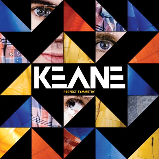
Concerning the digipak I have used a conventional layout in a plastic case with a booklet in the front and a back cover also. The imagery is fairly conventional with an image of the lead singer on the front and bold block colours which attract attention and are inspired by the cover for Keane’s album Perfect Symmetry.
 Both of these coupled with the use of a Russian style font on my digipak creates a modernist art deco style which uses block colour to make a bold statement. It also creates a sense of propaganda through its postmodernism, which is also very popular within the imagery of album covers for example Franz Ferdinand:
 I have tried to create a band style with the repetitive use of primary colours and green and to complete it I have created a logo for the band so that they are easily recognisable; as Goodwin said “artists develop motifs which recur across their work”, this is extremely useful in merchandising and advertising. During my research on logos I realised that all the band logos that are very prolific tend to be quite simple or built on already recognisable images, like The Ramones logo that is based on the official seal of the Director of National Intelligence in America:
 As I created a band logo from scratch I had to make it match the band style, so I used the same colours in the production of this logo:
How effective is the combination of your main product with ancillary texts?
Initially I planned an Album cover that would contain imported stills from our music video, which would relate to the tracks. However the research I conducted suggested that artists’ sleeves do not conform to this principle. It is for this reason that I did not use any imagery from the music video in the production of the digipak. Instead I decided to use a close up of the lead singer, (inspired by Franz Ferdinand's album which has been referenced previously) in order to strongly promote the lead singer and thus the whole band would benefit from this.

The band also benefits from the “recurring motifs” that I have developed in my digipak and magazine advert as researched by Andrew Goodwin who thought that recurring motifs and band styles are easily recognisable to audiences and developing fan bases. So by creating a band style using repeated colours on all four faces of the digipak and on the magazine advert with the same Russian style text also used, a band profile/style is created by which audiences can easily identify that style with the band. On top of this the creation of the logo (shown above), although not used on the magazine advert, creates an image that is easily recognisable and is very useful in merchandising especially to sell at gigs. So the logo can be applied to t-shirts and other fan memorabilia.
What have you learned from your audience feedback?
How did you use media technologies in the constructions and research, planning and evaluation stages?
In all of these aspects of work the main piece of technology that has been used is the blog, on which I am now writing. It gives us students a new method of creativity, as we can add little bits to it at any given time and instead of carrying large numbers of folders and sheets of all the work we have done over the year to and from school we are now able to upload work straight onto the blog where constant feedback and guidance from teachers and peers can be given via the messaging service at the bottom of each post. The blog also lets me embed photos, powerpoints, and videos so that it is a lot more easy to read and the texts i reference are right in front of you.

The digital cameras we used to film the music video were Sony Handycams (shown above) and they allowed us to review the raw footage we had captured and thus make improvements and progress. As can be seen from the photo the camera's screen also turns round which means that a variety of shots can be achieved with losing the accuracy of seeing what you are shooting. On top of this these cameras also have an inbuilt zoom function which we used in the shots over the shoulder shots on the bridge to create a new dynamic to the footage and to create a nice transitional fade of two zooming shots together.
Editing software also had to be used in constructing the music video. The programme we used was Adobe Premier Pro which is a new version of editing software that has more features for us to utilise, for example the shot transition near the end of the video in which a fast zoom in and out of two shots creates a nice juxtaposition of the female and male characters searching for the same thing whilst allowing us to change the speed to fit in with the pace of the song. As well as providing new effects the programme also allows us to easily synchronise the visuals with the footage in accordance with Goodwin's theory in which the visuals reflect the sounds.
After designing my print productions, the next step was to take the necessary photos; for this I used a digital camera which allowed me to look through the pictures already taken and to discard any that were not good enough and to make revisions where needed. This made sure that the picture I used in my final print productions was just right.
After collecting the necessary photos the design had to be edited and finished; for this I used Photoshop Elements 7.0 which allowed me to create layers of design which would not affect other aspects of the design and would help in finding the perfect colour scheme which was vital to my design. Once the correct colours were found the programme also allowed me to apply them to all pieces of the print production package.
Research
At the beginning of the course, when trying to find an unsigned band to promote I found that the internet was a very useful resource in that websites like myspace.com and unsignedbandweb.com had a comprehensive selection of bands with songs that had enough dynamic to create a music video around.
In any kind of media research YouTube is a very important internet resource, and when researching similar texts and my music investigation it was extremely useful as it gave me immediate access to the artist's music videos and also the user comments which were especially useful in my media investigation. In my media investigation, powerpoint presentation was a useful programme as instead of writing an overly long essay the essential points are written down and explained thoroughly but without the bore of having to read lots of text. It also allowed me the easily embed photos and hyperlinks to websites.
My research into audience was aided by the microsoft programmes powerpoint and excel which allowed me to create lots of graphs to present the result of the large quantity of questionairres handed out to our peers. We distributed these questionairres via email which was also very useful and impartial.
Planning
Many different texts influenced our music video and so we have used many different technologies to view these for example, american beauty was a DVD but the footage could be found on YouTube. The Madonna painting could be found on google images, etc. So normal media consumer habits were eventually what inspired our music video.
When planning where to shoot our music video, we went location scouting around Norwich using another digital camera which abled us to go back and see the images of all the places we had found and weigh up all the positive and negative points about each one, thus allowing us to easily find the best places to film.
To upload pieces of planning, like the storyboards I had to use a scanner which was useful to get physical pieces of work onto the computer.
Evaluation
The blog has also assisted me as I have been able to upload pictures into my evakluation so that they can be compared and to amplify the points I have made in my writing. On top of this the feedback I have received from strangers on top my blog has been quite encouraging, although some I have been unable to read, and others are a little strange, but all the same it means that my work must be interesting, which is always good news.


 Here I have removed the tour date to make it less cluttered and have enlarged the image of the album to just advertise that. It is this which is my final magazine product and is the one I have chosen to use in conjunction with the digipak and the music video because the image of Tamas joins the three and the block colour pattern joins the digipak to the magazine advert as well as the image of the digipak on the advert.


 For these reasons I decided to attempt to create a simple yet effective logo for The New York Fund. It had to conform to the band image I had already created with the
 The straight lines emerging from her face reflect power and control is a lot like propaganda posters. The soviet propaganda poster below is extremely similar and the message emmited by the image seems to be one of pass on the word which is a very clever marketing technique to make the product popular.

 paganda texts, to make up an A shape that stands for Athlete! The bold block colours make a big statement and have a connotation of power and brilliance.

 Another of Neil Young's album covers which is of stark contrast to that of the one above which is bright and cheerful, this album,
  The Band
 The Band's album inventively named The Band (released is very plain with a picture taken of them at Woodstock. The
  Ryan Adams
 Similarly, this image on Bryan Adams album reflects the title of the album; '
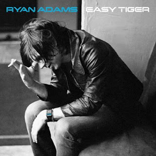

